Wednesday, December 22, 2021

Christmas Maps

So it's that time of the year again and about time for an end-of-year post.

Some news in Maps for the upcoming GNOME 42.

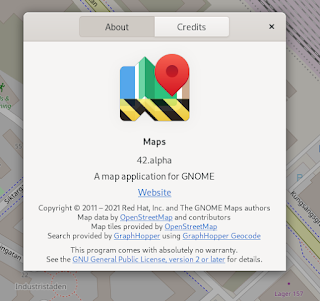
Finally, we have added support for running development versions of Maps (such as from the Nightly Flatpak repo) in parallel with the stable ones

The develop one is distinguished by the “cogwheel” background in the headerbar, and also by it's ”bio-hazard” strip icon as seen above.


Also we've had an old feature request laying around about supporting a command-line option to initiate a search.

In the meantime in Evolution there was discussions about being able to launch a search using a configured map application, rather than just using the OpenStreetMap web-based search. In that issue it was suggested there is a draft maps: URI scheme that has been used by Apple Maps on iOS.

So I have implemented this is Maps, so that Maps will now register as a mime-handler for the maps: URI scheme. And you can then open URIs of the form something like:

maps:q=search%20query

This could be tested from the command line using the gio command

$ gio open maps:q=search%20query


I also took the opportunity to add a DBus action to perform search.

This can be tested using a command-line like the following:

$ gdbus call --session --dest org.gnome.Maps.Devel --object-path /org/gnome/Maps/Devel --method org.freedesktop.Application.ActivateAction 'search' "[<'search query'>]" "{}"

 or by using the d-feet DBus debugger


 (and even though the output states no return, Maps will actually launch, or activate the currently running instance with the search performed).

And I also implemented an old-school command-line argument -S with the same semantic (taking the search query as it's argument) as per the original feature request.

These will either show the search popover in Maps when there are multiple search results, or just open the place bubble with the place selected when the search was specific enough to have a single result (such as when searching for a contact's address).

 Furthermore, as a little refinement the routing instructions for turn-by-turn based modes now also makes use of the u-turn icons:


 There was also a corner-case bug introduced by me when refactoring the instruction types to decouple them the GraphHopper-specific codes, resulting in a bug in some cases with u-turns preventing the route to show up. This was spotted, and fixed by one of our newcomer contributors Marina Billes.

One thing missing when it comes to the instruction icons by the way is that we miss icons for “keep left” and “keep right”. So I've created an issue for that (https://gitlab.gnome.org/GNOME/gnome-maps/-/issues/410). (I first gave Inkscape a go, but I quickly realized icons attempt to draw looks more like deformed sausages :-) ).


Another thing that's been on my mind for a while is the default zoom levels we use when “going to” a place when selecting a search result. Currently we find a suitable zoom level based on the so called bounding box of a feature (when it's available in the result item). This means things like buildings and parks can usually be shown initially so that it fits in the present window. For other object that are mere nodes (just a pair of coordinates), we have used some presets based on the place types as defined by the geocode-glib library. But these are quite limited and only covers a few cases.

So I started playing with a WiP branch to select more fine-grained default zoom levels for more place types with a heuristic based on the types we get from the OSM data.

This way, e.g. the continents (which are represented in OSM as nodes) gets a better fit, and not just defaults to a fully zoomed-in (as a fallback) place somewhere in a rural area or such:


And also a few more distinct levels for different place “sizes”, such as hamlets so we don't have to resort to a “one size fits” all level more suitable for larger towns and cities:


And I guess that will wrap it up for this time!

Happy Holidays everyone!
Monday, September 20, 2021

Maps and GNOME 41


 It's been a while since my last blog post. And in the meantime GNOME 41 was released. So I thought it would be time for a new post, although there's not been that much news to show in Maps itself since the last update (where I showcased the refreshed icons for search results.

But a few small visual improvements have been done since.

Already in 40.0, we made the display of population numbers for places (such as towns, cities, and similar) locale-aware. So that it now uses localized digits and decimal separators.


Now in 41.0 another small refinement has been made to show elevations below mean sea level expressed in words, rather that just showing a negative numer (which, although correct, may look a bit technical):


Also along the lines of visual polish, we now show population numbers in a rounded format if the value is an exact multiple of 100,000, assuming such a figure is most likely not an exact number but rather an approximation.


This utilises the localization API from ES (JavaScript) and as can be seen here gives a localized unit suffix and also in the case of Japanese as shown in the last example, the multiple in this case is 10,000, as this is based on traditional Chinese numerals, with denominations 10⁴, 10⁸ and so on. So in this case it would translate to “800 ten-thousands (man)”.

And over in libshumate (the new GTK4-based map rendering library we're working to eventually replace libchamplain, and enable migrating to GTK4), James and Corentin has been busy.

Among other things, James has implemented rotation support (for pinch gestures on tough screens among others), fractional scaling (should make smoother pinch zooming possible, something that has been quite poor currently in libchamplain, and thus in Maps). Also he started working on a renderer that vector format tiles:

Using vector tiles is something that's been in long-term plans for a long time. One thing that this could enable is the possibility to download map data for offline usage, something that is not really feasible with bitmap tiles. But actually I think something perhaps even more useful could be the possibility to render names in the user's language. This has always been an area where compromises had to be done. For example Mapbox' street tiles uses English names in the default tile set which would have the benefit of rendering as something that many people could read out as common Romanized transliterations of place names where the native reading is in a script they can't read. The downside being that they see place names near there home always in English, even though they could read (and might be more familiar with) the native reading. On the other hand the default openstreetmap.org tiles (which Maps now uses) renders the native names (which is better for your home location, but vice versa would make any place where the native script is unfamiliar not understandable).

And myself I have started on a little side project GNOME streets. a style for rendering bitmap tile maps using the GNOME color palette (though only some parts of the map uses these colors so far):


Eventually such a style could either be deployed on a GNOME-hosted bitmap tile server, or it could perhaps be used as the base of a stylesheet for rendering vectors tiles client-side in Maps.

So, over and out for now, until next time!

Tuesday, May 4, 2021

Spring Maps

 Since it was a while since the release of GNOME 40, I thought it might be time again for a post.

Since the 40.0 release there's just been a bug fix release (40.1) where, among other things, a bug where toggling a place as a favorite and then “unfavoring” it again, made it impossible to select that place again until restarting Maps.

And in master, leading towards 41 there's also been some goings-on.


A new Bookmarks button icon

First, one issue that was brought to our attention was that since we've used the star icon both for the favorites menu button in the header bar and for the button to mark a place as a favorite in a “place bubble” and this get a bit confusing when the new adaptive mobile mode is active. Since in this case the favorite button moves to the bottom bar and this lines up the favorite button in the place bar shown above that when selecting a place.

So, to mitigate this we decided to adopt the same bookmark icon as used in GNOME Web (Epiphany) for the favorites menu button to keep them apart.

In the desktop layout it looks like this:


And when in the mobile “narrow mode”:


Here, the buttons can be seen horizontally aligned, with the top one being the button to mark the place as a favorite.

An overhaul of the search result icons

For the icons shown in the search results list we always relied on the icons provided by the libgeocode-glib library. This has had some issues, however. For one this icon set is quite limited, so most places has just received a generic pin icon.

So now these have all been replaced with fresh new icons from the GNOME icon catalog:


Jakub Steiner also drew up some brand new icons for, among other things cafes (shown above), pubs, bars, cities, and towns.

These icons are also proper symbolic icons, meaning they adapt to the dark (night mode) theme also:


In contrast to the old icons, which didn't look to great against a dark background:


Furthermore, bus stops, train stations, and similar will now use the same icons as where already used to render journey plans, so this looks more consistent

I also couldn't resist adding a bit a fun as well, so now zoos get this little penguin icon:


Validating Wikipedia refs when editing OSM POIs

I also added validation for Wikipedia references when editing places. So now it will warn you if the reference does not follow the style language-code:Article title (such as “en:Article title“ for example).


The light bubble, as before, will show a hint explaining the format. And still  like before you can also paste in a URL from Wikipedia, and it will automagically re-format it, so for exmple it converts https://en.wikipedia.org/wiki/The_article_title → en:The article title.

Improvements to libshumate

And over in libshumate (the new library we're working on to enable migrating to GTK 4.x and away from using Clutter) Georges Basile Stavracas Neto and James Westman has been working on a number of improvments. So that now smooth scrolling works (meaning that when you let go of the mouse or touch pad gesture while in motion the map view continues moving a bit with inertia) and fractional scaled zooming that will be built upon later on when adding support for smooth animated zoom and pinch gestures for touch screens.


And that's that until next time!

Monday, March 15, 2021

Maps and GNOME 40

 As we have just pushed out the release-candidate before the GNOME 40 release next week I thought it would be appropriate with a little summary of the news for 40.

The first big visual update this cycle has been the new updated “place bubbles” redesign by James Westman:


This has already been covered in earlier postings, but still earns mentioning when summing up.

I also made some tuning to the way we present the information for places. The title will now show the place' name in the user's language, when that is available in the OpenStreetMap data. Also it will show the place' native name, as locally written, when they differ:


The other big update has been further improvements of the interface' adaptiveness for mobile (narrower) displays, also by James. When selecting a place marker from a search result when in mobile mode, instead of showing the popover style we use for desktop, a ”place bar” at the bottom now appears:

And when clicking/tapping on this bar, a dialog (which will fill the entire space on smaller displays) appears:

Though not yet used by Maps, there's also been a lot of progress made on the new map rendering library libshumate, based on GTK 4 that is set to replace libchamplain and which will let us move away from depending on Clutter and thus also allow migrating from GTK 3.

James Westman and Georges Basile Stavracas Neto. The demos accompanying the library has been consolidated into a single demo application and also gained a Flatpak manifest, which means the demo can be run directly from the GNOME Builder IDE, allowing to “run” the library direcly when making changes. Georges also implemented so called ”kinetic scrolling” (meaning the view has keeps some inertia when you give it a ”push”, which greatly improves the feeling of smoothness as it doesn't stop abruptly, moving one step further towards providing a matched look-and-feel to what we currently have with libchamplain.


James also implemented a test tile source, which can be showcased using the drop-down menu in the demo app. This test source shows the background tile indexes (the TMS tile coordinates, https://wiki.openstreetmap.org/wiki/TMS ) which can be handy for debugging, as well as serves as an example of writing a custom tile source implementation.


And as always, stay tuned for coming updates on the progress towards GNOME 41 and other stuff coming!

Cheers!


Sunday, February 28, 2021

Excursions: Driving on the wrong side

I think it's about time for the next installment in the Excursions series.

One area I was always interested in this a long time back has been transportation-related infrastructure like roads and rail. And a fact that comes up quite naturally along that is the “sidedness” of traffic in different countries. Today a majority makes use of right-hand traffic, but this has changed over the cause of time. It is sometimes said the prevalence of right-hand traffic in Europe (and the Western world in general) is related to Napoleon and him wanted to keep England “at arms length”. This seems to quite disputed though…

But rather that going through various countries handedness here. I thought we should look at something more interesting and quirky. Because as it turns out, it's not always the case that the standard is entirely the same within a single country.

For the first example we could take the United States. Driving on the right, right?

Well, mostly, but there's an exception as it turns out:

The territory The US Virgin Islands is actually left-hand traffic.

Wikipedia 

https://openstreetmap.org/relation/286898

Here we can see a map view of the capital city Charlotte Amalie, and on the follow view we can clearly see LHT on a dual carriageway street:


And talking about the United Kingdom (LHT, and remember the Napoleon remarks…). Despite being a well-known LHT example, especially in a European context, there's a part of the UK practicing RHT. Namely Gibraltar:

Always sharing land border with Spain this was more practical it seems…

Another quirky feature in Gibraltar is the level-crossing with the runway on the airport on the main road (connecting with Spain) Winston Churchill Avenue (Wikipedia)

It has crossing gates and lights, pretty much like on a railroad crossing… except when it's ringing, a Boeing 737 might zip by…


Next we go east to Hong Kong. Under British influence Hong Kong practiced left-hand trafic. And this has been kept also after 1997. Thus on the borders to mainland China contraptions like these can be seen to facilitate switching sides:


And not far from there we have a similar situation in Macao. When Macao was a Portuguese colony from the 16th century until 1999. And while Portugal itself switched from LHT to RHT in 1928, in Macao LHT continued, and it has been retained. A similar “trafic carousel“ as in the Hong Kong case can be seen at the mainland side of the Lótus Bridge (Wikipedia).


On the more quirky historical case is a road near the lake Björkvattnet (geo:64.608587,13.700729;crs=wgs84;u=0) in Jämtland in Sweden. While Sweden was LHT until 1967, neighboring Norway had been practicing RHT since a long time before. So when a new road was built between Kvelia and Tunnsjø (in Norway), the shortest and most conveniant option was to build the road for a stretch through Sweden. But imposing left-hand trafic on this single and at the time not connected to other roads in Sweden seemed inconvenient. So this road (and residents living there) was just practising RHT. And the only connections where through Norway anyway (the Z822 road leading to Gäddede and connecting to the rest of the Swedish road network was not built until some time after 1967, I think I read some discussions on this and when the roads where built at some forum, but I can't find those again…).


And also speaking of quirks, we also have the Punte Umberto I bridge in Rome https://openstreetmap.org/relation/5679034

Wikipedia 

The bridge itself is actually LHT (fortunately, maybe, there's a median fence).

And while speaking of countries switch sides, it seems historically it's been most common switching from LHT to RHT. But there's case of the opposite as well. After WWII Okinawa was occupied by the United States and RHT was practiced there, but in 1978 (six years after control of the islands was returned to Japan) they switched back to LHT.

https://openstreetmap.org/relation/4556086

Arguably this could be seen more as a case of reverting back to how it was before and getting back to the standards in the rest of the country. But still a bit interesting, I think.

And there is actually plans for a country as a whole to switch from RHT to LHT. And this is in Rwanda. The motivation would be that neighboring countries are predominantly LHT, so besides benefits of being similar to neighbors, prices of used vehicles with the steering wheel on the right side are generally lower.


Here's a map view from the capital Kigali:

https://openstreetmap.org/node/60485579


And by the way, if you use GNOME Maps, you can paste the openstreetmap.org URLs and geo: URIs directly into the search bar to go to these places.


So, let's see what we should explore next time!